In the early days of product development, everything tends to move quickly. The team has just a handful of developers and designers. Everyone communicates easily. Adding a new page or building a new feature takes only a few days. This speed comes from everyone being close together, sharing the same context, and making decisions immediately without complex processes.
But as the business grows and the Frontend team expands from 3 people to 20 or more, the result isn’t faster development — it’s slower. The same button exists in multiple versions. Modals look different across teams. Spacing and Typography follow different standards from team to team. Developers spend large amounts of time building the same components over and over. Designers have to fix the same details every sprint. Code reviews take longer because there’s no shared standard to reference.
In the end, new features take far more time than they should — even though the team has grown several times over. The problem isn’t that developers are working slowly. It’s that the system has no “foundation” that supports growth. And that foundation is a Design System.
A Design System Is More Than a UI Library

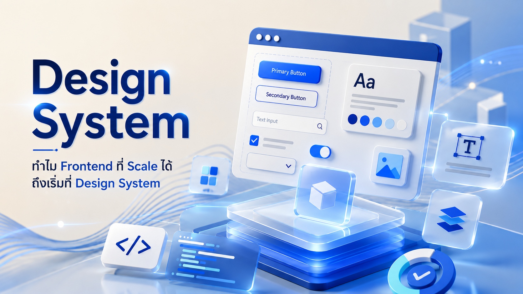
Many people assume a Design System is just a set of colors, fonts, or components for designers. In reality, its scope is much broader. A Design System is the shared standard that allows everyone in the organization — Designer, Frontend Developer, QA, or Product Team — to speak the “same language.” It encompasses Design Principles, Design Tokens, UI Components, Interaction Patterns, Accessibility Guidelines, Documentation, and Code Components that are ready for real use.
When every team references the same standard, every page in the system remains consistent — both in Design and Engineering. What once existed as individual decisions becomes a shared agreement that everyone understands from the start.
Design Tokens: The Smallest Foundation of a Design System
Design Tokens are the smallest building blocks of a Design System — but among the most important. They define every foundational value in the system: colors, font sizes, spacing, border-radius, shadows, and more.
Rather than having each component use raw values directly — like #1737C8 or font-size: 16px hardcoded — Design Tokens turn those values into meaningful names: color-primary, font-size-body, spacing-medium.
The most obvious benefit of Design Tokens is what happens when a brand color needs to change, or when the Typography scale across the entire system needs adjusting. Instead of hunting through and fixing every component individually, the team changes the Token in one place — and the update propagates to every component in the system automatically.
Design Tokens also serve as the bridge connecting Design Tools like Figma with the Codebase. When tokens are defined consistently on both the Design and Code sides, the gap between “what the designer designed” and “what the developer built” narrows significantly.
Organizations that establish a token system early discover that adding Dark Mode, supporting a new brand, or refreshing the design of the entire system becomes work measured in days or weeks — not months.
The Problems a Design System Solves Aren’t About Aesthetics
Many organizations begin building a Design System because they want their product to look more consistent. But the more important outcome is development speed. When a component is built and tested once, developers don’t need to recreate it for every project. Designers don’t have to redesign the same button again. QA doesn’t have to retest the same behavior every time.
Teams can assemble new features immediately from components that have already proven themselves in real use. Time that was previously lost to repetitive work gets converted into time for creating Business Value.
What Makes a Good Component in a Design System
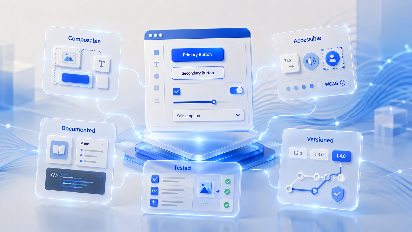
A component that lives inside a Design System isn’t just code that works. It needs to be designed to function reliably across a wide range of contexts.
Composable — Components should be designed so they can easily be combined with other components, without hardcoding too many assumptions about the specific context they’ll be used in.
Accessible — Components must support keyboard navigation, screen readers, and WCAG standards so that users of all abilities can use them — not just the typical user.
Documented — Every component should have clear documentation that describes the props it accepts, use cases, and copy-paste code examples. A component with no documentation is a component that gets avoided.
Tested — Components should have automated tests covering visual regression, unit tests, and accessibility checks — so that future updates don’t break things that already work.
Versioned — When a component changes in a way that isn’t backward compatible, teams currently using it need time to migrate. They shouldn’t be forced to change immediately without notice.
When every component in a Design System has these qualities, every developer in the organization can pull them in confidently — knowing they’re tested, documented, and designed to work in many contexts. That confidence is what makes Code Reuse actually happen in practice, rather than components sitting unused after they’re built.
A Design System Is Frontend Infrastructure
Just as Backend has APIs and Cloud has Infrastructure, Frontend has a Design System. Every time a user opens an application, what they see is hundreds of components working together. If each team builds its own components, the volume of code grows rapidly, bugs increase, maintenance becomes harder, and Technical Debt accumulates unnoticed.
By contrast, when every team uses the same components, a single fix can propagate to every product at once. The organization can develop faster without trading off system quality. This perspective transforms a Design System from “a design team concern” into a part of the system architecture that every function must co-own.
The Larger the Team, the More Critical the Design System
Many organizations have multiple teams developing products in parallel:
- Some teams manage Mobile
- Some teams manage Web
- Some teams manage Portals
- Some teams are building entirely new systems
Without a shared standard, each team makes different decisions. The result: the same product delivers inconsistent experiences. A Design System creates Governance for Frontend.
Every team can work independently, yet still deliver the same experience to users. This is why enterprise-scale organizations can develop dozens of products simultaneously while preserving UX quality.
How a Design System Reduces Technical Debt
Frontend Technical Debt doesn’t only come from incorrect code — it comes from “building the same thing many times over.” When you have 15 button variants, 20 input variants, and multiple card versions, every time you need to change a theme, update colors, add Dark Mode, or support a new brand, the team has to modify hundreds of files.
But when everything references Design Tokens and Shared Components, changes can happen from a single central point. The cost of maintaining the system drops dramatically — and the risk of inconsistency across screens drops with it.
How to Start Building a Design System Without Doing Everything at Once
One of the most common misconceptions is that a Design System must be perfect from day one. Many teams hesitate to begin because the scope feels overwhelming.
The reality is that good Design Systems typically start small and expand according to real needs.
Phase 1: Design Tokens — Begin by establishing foundational tokens: colors, font sizes, spacing, and border-radius. This phase doesn’t require building new components — it just means giving the values teams already use agreed-upon names that work organization-wide.
Phase 2: Foundation Components — Identify the most frequently used components across the system — Button, Input, Card, Modal, Typography — and build and document those well first, rather than trying to tackle every component simultaneously.
Phase 3: Pattern Library — Once Foundation Components are ready, start documenting recurring Interaction Patterns: form validation, empty states, loading states, error handling — as patterns that teams can use directly.
Phase 4: Governance and Process — Define the process for contributing new components to the Design System: how reviews work, how releases happen, and how other teams can request new components in a structured way.
This approach lets a Design System grow alongside the organization’s real needs, rather than trying to build everything upfront — which often results in teams never starting at all.
How a Design System Actually Helps Teams Develop Faster

Organizations that invest in a Design System typically don’t measure success by the number of components. They look at business outcomes, such as:
- Shorter Time-to-Market for new features
- Faster onboarding time for new developers
- Higher Code Reuse
- Fewer UI bugs
- Less time spent on Design Review and QA
- More consistent products
When teams no longer have to spend time on repetitive work, they can focus on solving business problems and building meaningful innovation.
Design Systems and Multi-Platform Support
Today, a single product often needs to run across Web, iOS, Android, and possibly Desktop too. A well-designed Design System can support multiple platforms without starting from scratch every time a new platform is added.
The most common approach is to separate the Design System into two layers:
Design Layer — Design Tokens and Design Principles that are platform-agnostic. They carry the same meaning on every platform: color-primary, spacing-medium, font-size-body. This layer is the single source of truth that all platforms reference.
Implementation Layer — Code Components that implement those tokens in platform-specific frameworks: React for Web, SwiftUI for iOS, Jetpack Compose for Android. Each platform has its own implementation — but every implementation references the same tokens.
When a designer updates a token at the Design Layer, every platform can sync that change simultaneously — keeping user experiences consistent across platforms, even though implementation details differ per platform.
This approach means organizations can expand products to new platforms faster, because the Design Language doesn’t have to be reinvented each time. Existing tokens and patterns just need to be implemented in the new platform’s framework.
Design Systems Require Clear Ownership
Even the best Design System in the world won’t function sustainably without clearly defined responsibility.
A problem common to organizations starting a Design System is treating it as “shared work” that every team collectively contributes to. In practice, when everyone shares responsibility, often no one truly takes it. Documentation falls behind. Components don’t get reviewed. Releases become inconsistent. The Design System gradually degrades until teams start building their own components again.
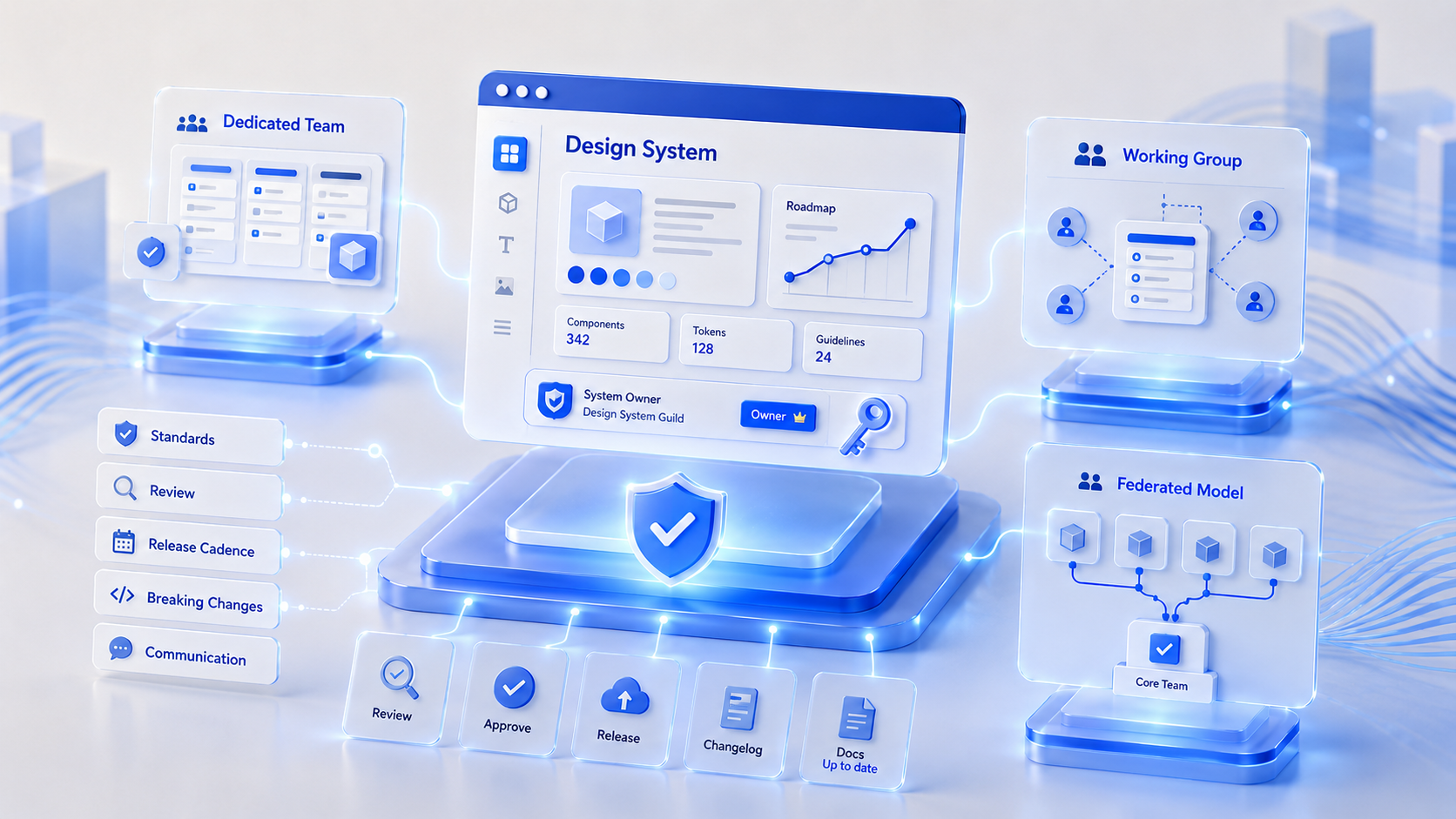
Organizations that succeed with Design Systems tend to establish clear Ownership — in one of several forms:
Dedicated Design System Team — A team responsible solely for the Design System, working full-time on developing new components, gathering feedback from other teams, and managing a long-term roadmap. Suited for large organizations with multiple products.
Working Group — No full-time team, but representatives from each team (Designer + Developer) who dedicate a portion of each sprint to maintaining the Design System. Suited for mid-size organizations not yet ready to form a new team.
Federated Model — Any team can contribute, but a Core Team reviews and approves before anything is merged into the main Design System. Suited for organizations that want broad contribution while maintaining quality control.
Regardless of which model is chosen, what matters is having a clear answer to: who owns this Design System, who decides on standards, who manages breaking changes, and who communicates to other teams when something changes. Because a Design System isn’t just a code repository — it’s an internal product that needs its own owner and roadmap.
A Design System Is a Long-Term Investment, Not a Cost
Many organizations hesitate to invest in a Design System because it doesn’t deliver new features that customers can see immediately. But in reality, a Design System is an investment in future speed.
The more teams an organization has, the more products it manages, and the larger its user base grows — the clearer the return on having a shared standard becomes.
Conclusion
As organizations grow, the challenge of Frontend is no longer just building new screens as fast as possible — it’s enabling multiple teams to develop together without losing quality, consistency, or delivery speed.
A Design System isn’t just a designer’s concern. It’s the engineering foundation that lets Frontend genuinely scale, reduces Technical Debt, increases Code Reusability, and allows every team to build new products on the same standard.
For organizations developing large-scale digital platforms, investing in a Design System today may be one of the decisions that most significantly reduces development costs over the long term — and ensures that business growth is never constrained by the limitations of the existing system.
At Muze Innovation, we believe great Frontend doesn’t start with writing code as fast as possible. It starts with laying the Architecture and Foundation that can support long-term business growth — whether that’s a Design System, Frontend Architecture, or Engineering Practices that help development teams work effectively from day one.
Contact the Muze team → muze.co.th/contact/